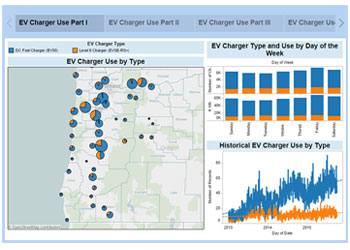
Various mapping techniques include:
Choropleth – color-coding areas by value.
Bubble map – data represented by size of bubble.
Pie map – bubble map, with qualitative divisions.
Dot density – values proportional to number of dots.
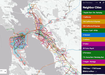
Route – typical map, with paths between locations.
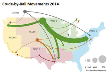
Flow – size and direction of flow as nodes and links
Area cartogram – distorted map, area indicates value.
Reduce clutter – include only information necessary to communicate your point.
Include only necessary features – don’t use map layers like roads and terrain without reason.
Choose colors carefully – see the style guide for color advice; consult ColorBrewer.org.
Be aware of distortion due to sparse population – rural areas seem more important, urban less.
Use tools to help with geo-coding – lots of free tools are available to enhance your data.
All Types of Maps:
Map Tools – ESRI ArcGIS/ArcMap, QGIS, and others.
General Tools – Google Fusion Tables.
For Developers – D3, R, Google Maps API, Leaflet.
Basic Maps (Choropleth and Bubble):
Visualization Environments – Tableau, Qlik, Microsoft Power BI and many others.
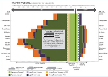
Variations on bar charts include:
Horizontal – bars extend horizontally from Y axis.
Vertical – bars extend vertically from X axis.
Clustered – multiple bars per group.
Stacked – single bar divided into segments.
Normalized stacked – segments sum to 100%.
Diverging – values are both negative and positive.
Population pyramid – two opposing dimensions.
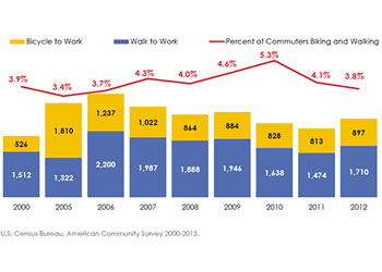
Start from zero – almost always, your bars should start at zero to show data context.
Sort the bars – seeing small differences is only possible when bars a close to each other.
Be careful with stacked bars – it is hard to estimate proportion or compare between bars.
Horizontal bars can make it easier to read labels – it can be hard to read vertical or slanted labels.
Use plain, flat bars – three dimensional effects or odd shapes make it harder to compare bars.
Basic Bars:
Visualization Environments – Tableau, Qlik, Microsoft Power BI, and many others.
General Tools – Microsoft Excel, Google Sheets, Google Fusion Tables.
For Developers – D3, R, Google Chart API.
Other Bar Types (Bullet, Histogram, Pyramid, Radial):
Visualization Environments – Tableau (Radial requires some effort), Microsoft Power BI (with custom visuals).
General Tools – Microsoft Excel (histograms starting with 2016).
For Developers – D3, R, Google Chart API.
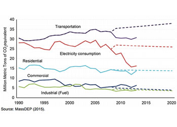
Line graphs plot data points on X and Y axes. Variations include:
Segmented line – straight lines between points.
Smoothed line – curved line connects points.
Area graph – area under line is color-coded.
Stacked area graph – areas under lines add up to a whole.
Label lines directly – when possible, put labels near lines rather than in a legend.
Highlight key events – use arrows and callouts or shade background to annotate significant events.
Decide whether to show points – data points can be different shapes as an additional cue to color, but lines without points are sleeker.
Select beginning and ending values carefully – represent patterns faithfully, don’t use scale to distort of exaggerate.
Basic Line and Area:
Visualization Environments – Tableau, Qlik, Microsoft Power BI, and many others.
General Tools – Microsoft Excel, Google Sheets.
For Developers – D3, R, Google Chart API.
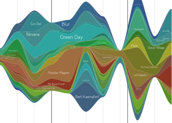
Streamgraph:
Visualization Environments – Tableau (sort of – area graphs diverge from center line), Microsoft Power BI (using custom visuals).
Various mapping techniques include:
Pie – circle divided into segments, with each segment representing a proportion.
Donut – pie with the center removed; a title or other information can be located in the center.
Sunburst – multi-tier pie or donut chart, showing hierarchical data.
Use ONLY when data represent a whole – the entire pie must be 100% of something.
Avoid too many slices – pie charts work best with no more than five or so segments.
Show at most one thin slice – a single thin slice can make a point; otherwise, group them as one.
Three dimensional pies are particularly problematic – apparent area of slices is skewed.
Consider a bar chart – if the point is to compare values, bar charts are better suited.
Pie and Donut Charts:
Visualization Environments – Tableau, Qlik, Microsoft Power BI, and many others.
General Tools – Microsoft Excel, Google Sheets.
For Developers – D3, R, Google Chart API.
Sunburst Charts:
Visualization Environments – Tableau (with effort).
Various flow diagramming techniques include:
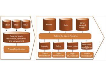
Flowchart – representation of a workflow or process with various shapes representing states or products and arrows possible transitions.
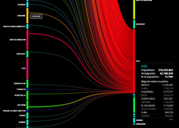
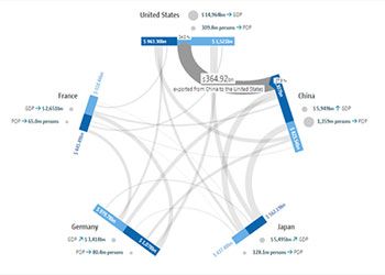
Sankey diagram – width of arrows between states vary proportionately with flow quantity; often used to show energy or money flow.
EventFlow/LifeFlow – a tool for event sequence analytics.
Minimize overlapping flows – complex flows may mean lots of lines crossing; experiment with various layouts to minimize that. Interactivity can help by highlighting one pathway on mouseover.
Data formatting can be tricky – you will need data for nodes and flows between nodes, with sequence and weight for each flow. Data-wrangling tools can help reformat data to the specifications your tool requires.
Flowchart:
Visualization Environments – Tableau (with some effort).
General Tools – Microsoft Powerpoint, Visio.
Sankey:
Visualization Environments – Tableau (with effort), Qlik (via D3 extension), Microsoft Power BI (with custom visuals), SankeyMatic.
For Developers – D3, R, Google Chart API.
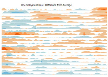
Various heat mapping techniques include:
Matrix – rows and columns show structure; color or shading indicates areas of interest.
Calendar – a matrix with seven rows or columns can show activity over a span of time or variance by day of week.
Smoothed areas – continuously enclosing shapes (think terrain maps) overlaid on a map or diagram indicating location.
Choose colors carefully – colors need to vary in saturation (light to dark) consistently; using variations of one color is a good choice.
Add heat maps to tables – coloring cells in a table can help identify high and low values efficiently.
Sort in a meaningful order – heat maps work best when clusters of cells are significant; you facilitate that by ordering rows and columns by some logic.
Resist rainbow colors – the perceived brightness changes abruptly and haphazardly.
Matrix/Calendar:
Visualization Environments – Tableau, Qlik, Microsoft Power BI (with custom visuals).
General Tools – Microsoft Excel (with some effort).
For Developers – D3, R, Google Chart API.
Smoothed:
Map Tools – ESRI ArcGIS/ArcMap, QGIS.
For Developers – D3, R, Google Maps and Visualization API, Leaflet.
Various flow diagramming techniques include:
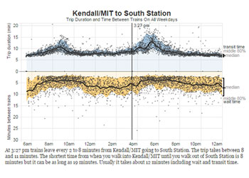
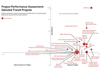
Scatter Plot – dots plotted on an x-y coordinate grid by two quantitative attributes.
Bubble Chart – a scatter plot where the area of the dots represents a third attribute.
Motion Chart – a bubble chart animated over time.
Area, not diameter – when using bubbles of different sizes, correlate values to areas, not diameters.
Consider adding reference lines – you can show targets or averages on each axis, or a regression line to show general tendency.
Transparency can help with overlaps – it will mean that overlapping dots get darker.
Can be a good way to find outliers – you may use scatterplots in your data analysis to spot issues.
Scatter and Bubble Plots:
Visualization Environments – Tableau, Qlik, Microsoft Power BI, and many others.
General Tools – Microsoft Excel.
For Developers – D3, R, Google Chart API.
Motion Chart:
For Developers – D3, R, Google Chart API.
Use meaningful or anthropomorphic icons – emotional imagery can increase interest and attract viewers.
Beware of volume distortion – if using icon size to show value, correlate to volume rather than height and width; use only one shape.
Arrange groups contiguously – in icon arrays, keep icons of one class together at top or bottom.
Use natural frequencies – viewers understand ‘x of 100’ (or 10) better than numeric percentages.
All Types:
Visualization Environments – Tableau, Qlik, Microsoft Power BI.
General Tools – Microsoft Excel, PowerPoint or Visio; Adobe Illustrator or Photoshop.
For Developers – D3, R, Google Chart API.
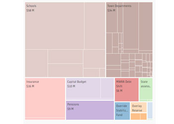
Clearly show and label hierarchy – a key value is the ability to compare things at different levels of the hierarchy.
Provide drill-down capability – allow viewers to examine one item in the hierarchy more closely and to get details about leaf nodes.
Experiment with changing dimension tied to area – it can be interesting to see how the treemap changes when based on national population or land area, for example.
Treemap:
Visualization Environments – Tableau, Qlik, Microsoft Power BI, and many others.
For Developers – D3, R, Google Chart API.
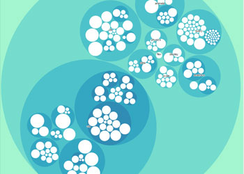
Packed Circles:
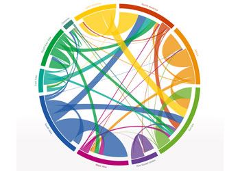
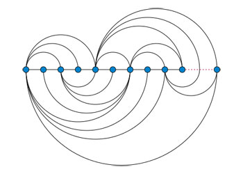
Various techniques include:
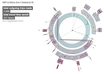
Arc – nodes along a straight axis, connected by arcs
Chord – nodes along a circle, connected by chords with width proportional connection strength
Tree/Organization chart – hierarchical connections, extending up or down from a root
Force-directed – drawn with algorithms
Hierarchical or ungrouped? – nodes in a network diagram may have a categorical variable that puts them in a hierarchy, or they may be independent. Arc and chord diagrams work primarily with independent nodes.
Use node and link size and color – you can encode additional variables to show patterns and relationships.
Experiment with layout – there are several algorithms for automatic layout.
Node-Link:
Visualization Environments – Tableau (with some effort), Qlik (with D3 extension), and Microsoft Power BI (with custom visuals).
General Tools – Microsoft Excel with NodeXL add-on.
Chord and other types:
Visualization Environments – Tableau (with some effort), Microsoft Power BI (with custom visuals).
For Developers – D3, R, Google Chart API (tree diagram).