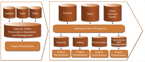
Asset managers need to: define their goals and targets; measure performance with data; describe how performance measures up to goals; document finances; describe how they choose investments; and show the impacts of these actions.

(Enlarge)
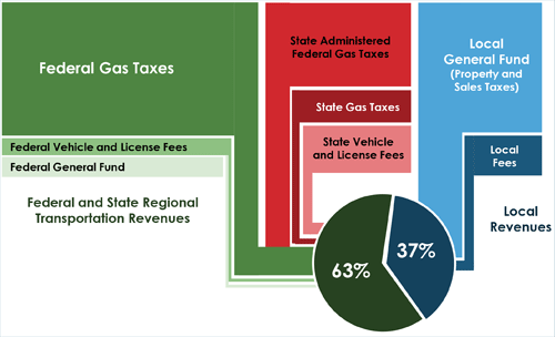
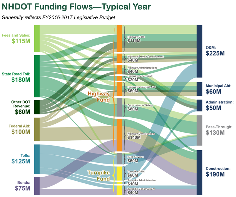
New Hampshire Department of Transportation, 2015
New Hampshire DOT (NHDOT) included this Sankey Diagram in its inaugural Transportation Asset Management Plan (TAMP). It shows the flow of funds from revenue sources on the left – through funds and programs in the center – to uses on the right, all proportionally-sized and colored by revenue source.
The diagram required a complex set of amalgamations and assumptions to align NHDOT’s revenue and expense datasets, which do not perfectly balance and had never previously been illustrated together. This was a task of both Data Wrangling and Analysis – cleaning the data tables so that they were speaking the same language and then modifying them to cleanly distribute the revenue of a hypothetical fiscal year.
The diagram itself was generated using SankeyMatic, a free online tool built in JavaScript, but easy to learn for those without coding experience. The final graphic was built in Adobe Illustrator by tracing a screenshot of the raw diagram.
(Source)
David Butler, Boston Globe, 2015
The Boston Globe ran this infographic on the newspaper’s front page on August 1, 2015. It includes a bubble map proportionally sized to the number of planned highway, bridge, and tunnel projects in the Massachusetts DOT’s ProjectInfo database. The bubble map is paired with a stacked bar chart showing projects by phase and a single stacked bar representing bridge condition.
Each element of this diagram can be generated using common visualization software. Microsoft Excel can replicate the stacked bar charts, and almost any free mapping tool (and Excel 2016) can generate a bubble map such as this one.
For compatibility with Excel, Microsoft PowerBI is a good bet. Tableau and ArcMap can also produce bubble maps. Adobe InDesign is the one of the best tools for building the final layout, but the pieces could also be assembled in Microsoft PowerPoint or Publisher.

(Source) (Enlarge)
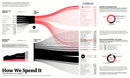
Town of Arlington, Mass, 2016
The Town of Arlington, Massachusetts developed “Visual Budget” to clearly communicate its investment decisions to residents and taxpayers. What makes the tool unique is that in addition to the pictured dashboard, visitors to the website land on a “tour” function that highlights sections of the page with key facts and interpretation. In addition, taxpayers can input their property tax assessment and convert some mouseover figures to show their own contribution.
The website is fully open-source, with Javascript code and data easily accessible on the website. Not only is the underlying data provided in JSON format (for the site itself) it is also provided in a CSV file that can be easily imported into Microsoft Excel.
An advanced user could modify the open-source code to create a similar tool based on any entity’s budget. However, the CSV file allows laypeople to create the included charts in Excel, Tableau, Microsoft PowerBI, or similar programs. The site primarily uses treemap and stacked area charts in addition to formatted text.

![]()


Urban planners need to: identify the population density of neighborhoods;Link peoples’ living and working locations; respond to residents’ concerns about development and transportation; and assess what a “nice place to live and work” can mean.

(Source) (Enlarge)
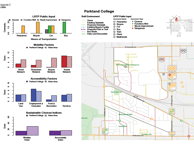
Champaign County Regional Planning Commission, 2014
The “Local Accessibility and Mobility Analysis” (LAMA) is an appendix to CCRPC’s long-term transportation plan. It explores regional variation in land use and transportation and relates that variation to travel patterns. The charts summarize the public comment, display the results of mobility and accessibility analysis, and compare these results to estimated travel behavior in the neighborhood.
LAMA was developed in R using data from not only CCRPC, but from the Illinois Secretary of State, the US Census Bureau, and Esri. The primary audience was local planners and decision-makers, who might be familiar with the community and with planning principles but who do not have analytical expertise in transportation.
A novice could replicate the column charts in Microsoft Excel and the map in ArcMap or QGIS. In CCRPC’s case, the positive feedback on the static version of the charts has led to funding for an online version, which can highlight subsets of the information for each neighborhood and focus the attention of the reader.

AARP has enlisted a wide-ranging set of in-house, private sector, and academic advisors to develop a summary metric for “livability” – specifically for the elderly – in each US ZIP code. The index has 7 components, and the data supporting each of these can be accessed by clicking on it. Clicking on any of the detailed metrics accesses a descriptive paragraph and a link to the source. The user can customize the weighting of each component to affect the final score, and can compare up to three locations side-by-side in tabular format.
In the words of Ben Schneiderman, the website displays “details on demand.” A user can get significant value simply from the dial, score, and choropleth map, but with each click the website provides additional useful information and features to those who seek them.
While an expert-level web development skill is required to replicate the full tool, these nested data and functionality mean that much of the value and functionality can be realized relatively easily. An intermediate knowledge of Microsoft Excel or Adobe Illustrator is necessary to replicate the dial, but a choropleth can be created easily in many visualization programs, including Tableau, Microsoft PowerBI, ArcMap, and QGIS.

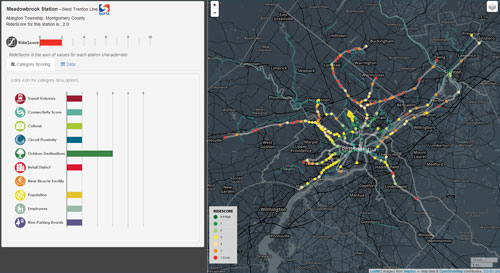
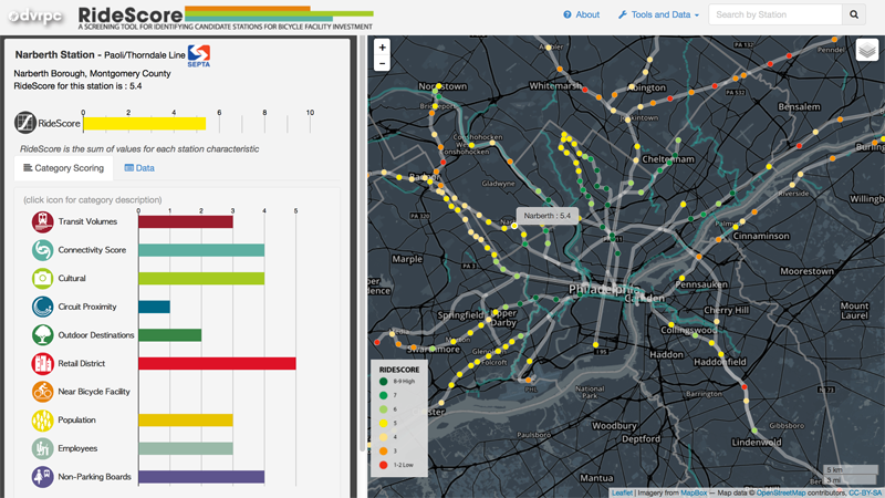
(Source) (Enlarge)
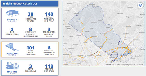
Delaware Valley Regional Planning Council, 2015
RideScore is a metric and online tool that describes bicycle accessibility where first- and last-mile issues are most important: commuter rail stations, trolley and subway termini outside of Center City Philadelphia. The overall RideScore for each location is the sum of ten 0-5 components (hence the total score is 0-50). Each component score represents a categorization of a metric (e.g., transit vehicles/day, number of cultural resources, population density) within a given radius.
DVRPC incorporated data from SEPTA, the National Establishment Time Series (NETS), the National Center for Education Statistics (NCES), the City of Philadelphia, and the US Census Bureau. The tool features a point-and-line map built that requires an expert-level knowledge of web development as shown in Javascript.
However, it can be replicated by less-experienced designers in GIS software including ArcMap, QGIS, and Google Earth. The bar charts can be replicated in Microsoft Excel, Tableau, and many other tools.

Urban planners need to: measure and communicate the environmental impacts of transportation; assess climate change sustainability and resiliency; measure the success of programs designed to reduce pollution and adverse consequences; and communicate how transportation planning can help the planet.

(Source) (Enlarge)
Massachusetts Executive Office of Energy and Environmental Affairs, 2015
The Massachusetts EEA provides an example of a line graph that resembles many others in public sector planning documents. Points of interest in this instance include:
EEA has directly compared sustainability metrics by converting them to consistent units (CO2 equivalent).
EEA has placed general residential, commercial, and industrial uses on the same graph as specific uses transportation and electricity consumption. This both illustrates and the magnitude of emissions from these specific sources and highlights the sharp decline in emissions from electricity generation relative to the other uses.
EEA has used dotted lines to distinguish projections.
This plot can be reproduced in Microsoft Excel by someone who can generate line graphs or scatterplots with multiple series.

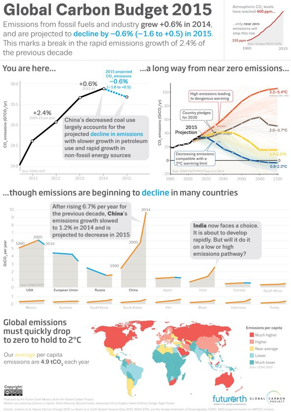
(Source) (Enlarge)
FutureEarth and the Global Carbon Project, 2015
The “Global Carbon Budget” infographic uses primarily line charts as well as a choropleth map to relate trends in national carbon dioxide emissions to global warming rates. The most powerful design decision was tying the color blue to declines and using it throughout the graphic, repeatedly emphasizing the style not only in the charts but also each time a decline is mentioned in the text.
This decision allows the reader to easily pick out that the USA, EU, Russia, Japan, and Canada (intuitively the nations that developed the earliest) have begun to decline in their emissions, while China and India have experienced steep increases. These charts are also shaded below the line to create Area Graphs, subtly hinting at the large total emissions resulting from those generation rates.
Line and area graphs such as these can be reproduced by a novice user of Microsoft Excel, though some skill is required to recognize and introduce stylistic cues such as the colored and dashed lines and the subtle inclusion of varying forecasts for temperature increase.

(Source) (Enlarge)
Oregon Department of Transportation, 2016
ODOT mapped and plotted Electric Vehicle (VC) charging station data from vendors to identify trends for the general public. It becomes immediately clear from viewing the page that EV charger use is highest in the Willamette Valley and on Fridays, and that use of DC Fast Chargers has increased steadily over the past 3 years.
These visualizations were created in Tableau Public, allowing for updates and mouse-over text that provides details on individual locations, days, and dates. The line graph and stacked column chart can be replicated in static form in Microsoft Excel by someone with relatively rudimentary skills. The pie chart/bubble map combination can be replicated with some effort in Excel and Microsoft PowerPoint (by copying each pie onto a map in PowerPoint), but is much easier to execute in Tableau.
Transit planners need to: communicate performance metrics such as ridership, delay, safety, and finances; show the extent of the system and services; illustrate typical transit, wait, and travel times; and demonstrate the value of the transit system to residents and to the local economy.
(Source) (Enlarge)
Alain Bertaud and Harry W. Richardson, 2004
Bertaud and Richardson have compelling data analysis to support their argument that greater density leads to greater transit use, but this illustration might have been all they needed. The darkened silhouettes of Atlanta and Barcelona strikingly convey the contrasting density of the cities and the potential relationship of that density to the prevalence of transit lines.
Only novice skills in ArcGIS or QGIS are required to replicate this graphic. Either tool will allow a designer to isolate and darken developed parcels (or census tracts, etc.) and overlay transit lines, all using free public shapefiles.

(Source) (Enlarge)
Mike Barry and Brian Card, 2014
Mike Barry and Brian Card created “Visualizing MBTA Data” as a class project at Worcester Polytechnic Institute. Drawing on the MBTA’s live data feed of subway train locations, they computed and illustrated the progress of trains over the course of a day using animation and position-time line graphs. In addition, they made their data personally relevant to the viewer by including averages and distributions wait, transit, and travel time (the last being the sum of the first two).
Barry and Card built their project using the D3 Javascript library. The interactive and animated elements of the website cannot be replicated without at least intermediate coding experience. An intermediate user of Microsoft Excel could replicate some, but not all, of the visualizations in static form.

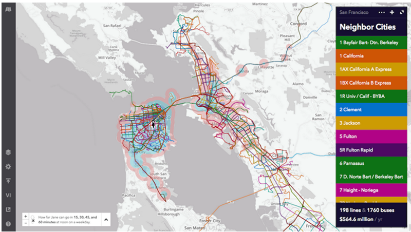
Remix is a Transit Planning start-up with a visually-compelling browser-based visualization and analysis tool. It allows the user to draw transit service on a map, place stations, and forecast operating costs, performance, and economic impact based on many integrated datasets.
In this series of screenshots, Remix uses isochrones (i.e., a heat map) to illustrate the areas that a transit user in San Francisco can reach using not only the City’s Muni network, but including all of the Bay Area’s independent and uncoordinated transit providers.
A user can of course replicate this visualization by using Remix itself. In addition, a novice in ArcMap or QGIS could produce a colored map of transit services provided that they acquired the shapefiles. ArcMap has the capacity for network analysis (to produce the isochrones) based on the underlying dataset, but this functionality is purchased separately and requires expert-level skill with the software.

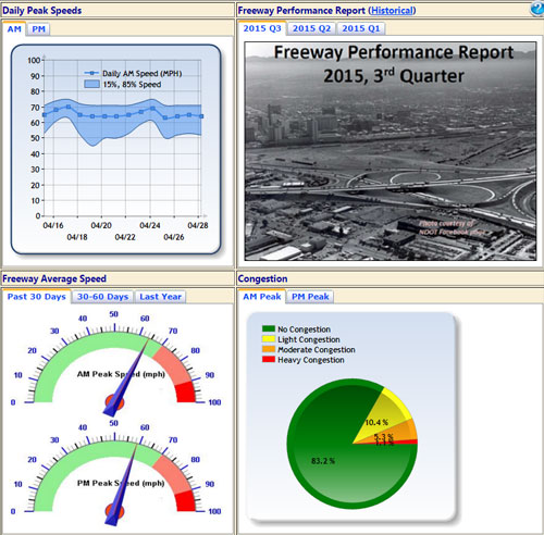
Highway engineers and planners need to: communicate performance metrics such as condition, volume and congestion, safety, and finances; relate these performance metrics to funding trends; show the extent of the system; visualize the response of maintenance and incidence response crews to improve performance; and demonstrate the value of the highway system to residents and to the local economy.
(Source) (Enlarge)
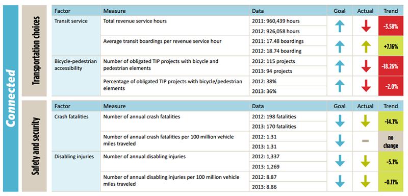
Mid-America Regional Council, 2014
MARC has inserted iconography and formatted text into this table of transportation system performance data and trends. Each panel represents one of the agency’s guiding objectives and relates that larger concept to performance metrics and goals. The table uses color to overcome the challenge that the agency desires some metrics to decline and others to increase – green always represents a “good” trend, and red a “bad one.”
This table was likely generated in Microsoft Excel and can easily be replicated by a user with a working knowledge of cell formats and time to place and recolor the arrows.

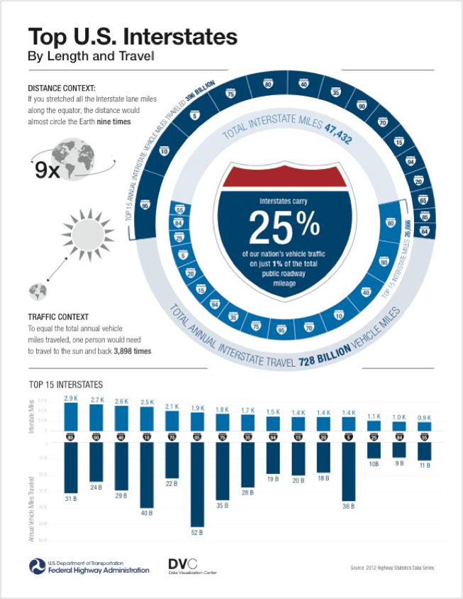
(Source) (Enlarge)
Federal Highway Administration, 2015<
This FHWA diagram illustrates the length of Interstates and compares it to annual miles traveled, but it’s memorable mostly because it’s so compelling visually. The color scheme, iconography, and formatted text all draw the eye into the nested donut charts. Below, the infographic uses both upward and downward-facing column charts to compare the top 15 Interstates by mileage and volume.
While the diagram was likely created in Adobe Illustrator or a similar advanced graphic editing tool, each element can be created in Microsoft Excel and PowerPoint with the exception of the curving text in the donut charts. A partial donut chart can be mimicked by creating a blank placeholder category and individually coloring it gray, while the downward-oriented columns can be replicated either by entering the data as negative numbers or in the axis options.

(Source) (Enlarge)
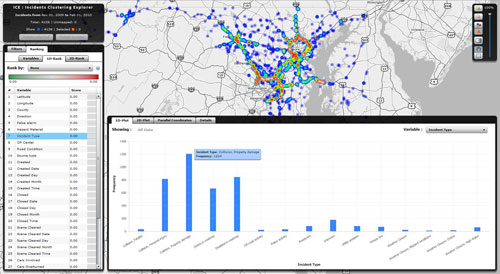
CATT Lab, University of Maryland, 2012
“Timeline” is a software package that places events in the course of highway incident response on a common time axis. These include the arrival and tenure of different emergency responders on-site, the closure of lanes, and average speed on the road segment. Generally speaking these things are shown as a timeline graph that could also be thought of as a heatmap.
The tool was designed for an audience of real-time traffic operators, emergency managers, and participants in after-action reviews for incidents. The same methodology can be applied in other time-sensitive response situations (e.g., hospitals) where decisions can lead to positive and negative outcomes.
The tool requires training to use and an expert level of software development skill to replicate. As a static representation of a single incident, however, the series of timelines showing emergency personnel response and lane closures can be replicated in Microsoft PowerPoint, Adobe Illustrator, and other diagramming tools. More advanced statistical analysis software is required to create the blended heatmap.

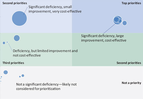
Transportation planners need to: establish a relationship between performance and funding; generate multiple scenarios for investments in programs and projects; illustrate the implications of different funding scenarios; and provide the most helpful information possible to augment the judgment of decision-makers.

(Source) (Enlarge)
Plan Bay Area, 2013
Plan Bay Area (PBA) is a long-term planning effort for the San Francisco/Oakland/San Jose metropolitan area led by the region’s metropolitan planning organization. To visualize the tradeoffs between different regional projects, initiatives, and investments, PBA placed them on axes tied to benefits, costs, and impacts. In this bubble chart, the size of the bubble represents benefits, while the vertical and horizontal axes represent B/C ratio and support for the project’s regional development targets.
Because the plot is limited to transit projects – and PBA is a transit-friendly effort – all projects fall on the right-hand side of the diagram. Note that projects are not sized by cost; expensive projects such as BART extensions appear small if their quantified benefits are small. While the credibility of the diagram largely rests on how well PBA can explain and defend its data wrangling and analysis steps, the diagram can support a decision to, for instance, fund only the projects that appear “big,” or those in the upper-rightmost region of the plot.
Microsoft Excel can be used to create bubble charts without a steep learning curve.

(Enlarge)
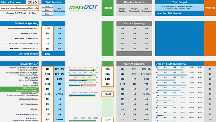
Massachusetts Department of Transportation, 2016
MassDOT uses the Planning for Performance cross-asset resource allocation tool to view the performance consequences of different investment portfolios, as well as to generate beneficial scenarios that reflect user preferences. The tool’s output page uses formatted text, bullet charts, and stacked bar charts to highlight key data, performance as compared to targets, and budget, respectively.
While the tool is built in Microsoft Excel, different visualization elements require different levels of skill to implement. Formatted text and conditional formatting are fairly basic skills, while the bullet charts are much more complicated to understand and to implement (though tutorials exist online).

(Source) (Enlarge)
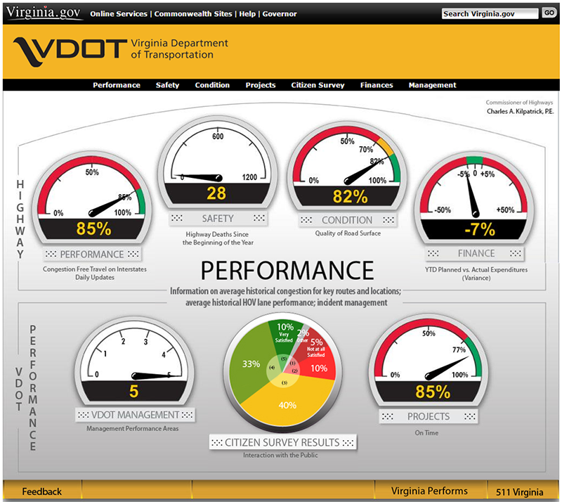
Virginia Department of Transportation, 2015
The VDOT Dashboard provides the public with up-to-date metrics on performance, safety, condition, projects, citizen survey results, and finances. The metrics are presented on the topic-specific pages using a variety of visualization techniques, including bar and column charts, iconography, and dials. The landing page summarizes the metrics using dials and a pie chart.
While VDOT utilized advanced web development and coding skills to build The VDOT Dashboard, Microsoft PowerBI, Tableau, and other visualization software packages can create dial charts and can incorporate them with pie and bar charts into a dashboard or report format that can be shared, automatically updated, and even published to the web. These are intermediate-level tools that require some familiarity and have a learning curve, but they are accessible through a user interface and do not require coding.

Freight planners need to: illustrate the volume and value of trade; communicate trends for carriers and modes; visualize the impacts of shipping on passenger travel and overall congestion; and relate trends in industry to their consequences for the transportation system.

(Source) (Enlarge)
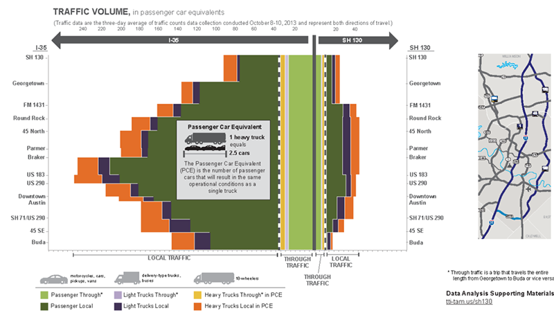
Texas A&M University Transportation Institute, 2015
Texas A&M university used this stacked area chart to illustrate the limited potential of SH-130 – a circumferential toll road in Austin – as a detour for through truck traffic currently using Interstate 35. Placing volume on the horizontal axis and (roughly north-south) location on the vertical, the plot clearly demonstrates the limited volume of through trucks in the narrowness of the yellow and lavender bands.
The clear implication is that if all the yellow and lavender (and even light green) volume switched to the SH-130 side of the diagram, the overall volume (and thus congestion) on I-35 would not appreciably diminish.
A graph such as this one would be time-consuming to assemble in common software tools, but because the volume is constant between exits, the same effect can be achieved using stacked bar charts in Microsoft Excel. The spaces between the bars can be eliminated to appear very similar to Texas A&M’s product. Any publication tool could then be used to assemble the infographic. The attached map can be produced in ArcGIS or QGIS by a novice user.

(Source) (Enlarge)
US Energy Information Administration, 2015
The US EIA has used a combination bubble map/flow map to show the transportation of crude oil by rail between regions of the US. In addition to communicating the overall amount of originating crude and the magnitude of each flow, the visualization color-codes the flows to match the regions, allowing a quick glance at one region to identify the size of flows from each other region.
Tableau, Microsoft PowerBI, and Microsoft Excel 2016 can generate bubble and flow maps. This graphic can also be reproduced using ArcMap or QGIS to generate the background image and adding the bubbles and arrows in Microsoft PowerPoint or a dedicated graphics program such as Adobe Illustrator.

(Source) (Enlarge)
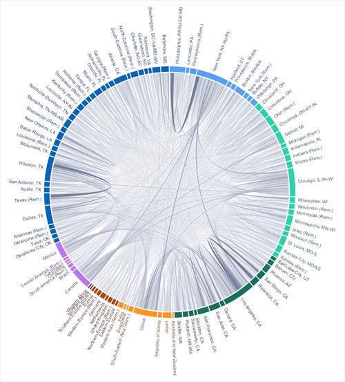
Bertelsmann-Stiftung, 2016
Bertelsmann-Stiftung uses a chord diagram to illustrate trade between user-selected countries. Mouseover text for the chords establishes the exact size of the flows. The column chart used to select the data year represents the total value of trade flows from the selected countries in each year.
Developing an interactive online tool requires expertise in web development, but Tableau, Microsoft PowerBI, and similar visualization packages can create chord diagrams with mouseover capability and publish them online.


(Source) (Enlarge)
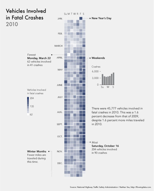
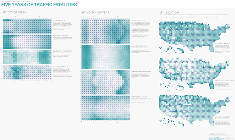
John Nelson and IDV Solutions, 2010
John Nelson uses heat maps with a calendar view and with a view of the US to show when fatalities occurred over five years and to describe their factors (alcohol, pedestrian, and weather). He brings them together along with text to create an infographic that builds a story of fatalities by day of week, month of year, and by location. The heat map and small multiples help the audience to quickly identify patterns.
The charts for this diagram can be created using Microsoft Excel using the conditional formatting function and some elbow grease – it means cleaning and parsing the data into the right format, especially for the map version, and selecting a pleasing color. Once the charts are built, this can be built in Adobe Illustrator.

(Source) (Enlarge)
Massachusetts Department of Transportation, 2015
The Massachusetts Top Crash Clusters map uses polygon shapes to highlight where clusters of crashes occur throughout the state. The DOT processed the data to identify which crashes were related to others spatially. The intent was to identify areas that need to be addressed more as a system than as single intersections or crossings.
The DOT handled data wrangling using ArcGIS scripts and mapped the resulting clusters using ArcGIS Online.

(Source) (Enlarge)
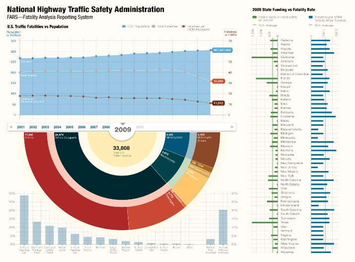
Boostlabs, 2016 (tel. 301-560-7901)
Boost Labs developed this infographic that compiles line charts to show fatalities versus population, a sunburst chart to show how fatalities in the US are distributed (for example, 33,808 fatalities in the US in 2009, 4,872 of which were nonmotorists, 630 of which were pedalcyclists), and bar charts in small multiples formation to compare state by state funding and fatalities.
Elements of this visualization can be recreated using Microsoft Excel and compiled using Adobe Illustrator. The sunburst chart can be produced using an add-in to Microsoft PowerBI.


(Source) (Enlarge)
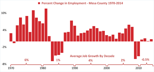
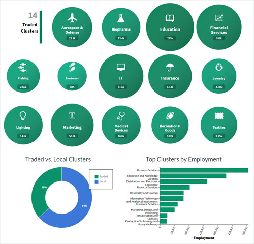
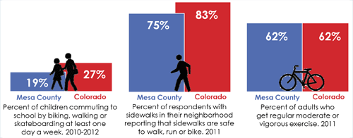
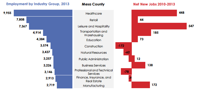
Mesa County, Colorado, 2014
Mesa County developed these funnel charts to show which industry groups had the highest levels of employment (on the left) and which were growing more quickly (on the right). The charts, when combined, show that retail, while one of the industries with the largest employment, has not grown over last several years. They also show that Leisure and Hospitality employment is growing faster than all other industries and is becoming an important economic driver in the region.
These charts were created using Microsoft Excel and combined using Microsoft PowerPoint.

(Source) (Enlarge)
Joe Meko, 2012
Joe Mako developed this set of stream charts combined into a state by state view using the small multiples approach. It shows how the unemployment rate in each state relates to the national average. He used orange lines to indicate states with above average unemployment and blue lines to indicate states below average unemployment. The stream charts are sorted from highest to lowest unemployment rates based on the most recent year of data. Showing these values over time show how West Virginia had high levels of unemployment in the 1980s but has lower levels of unemployment recently.
Joe Mako used Tableau Public to create this chart. In Tabluea, this chart type is called a horizon chart.
(Source) (Enlarge)
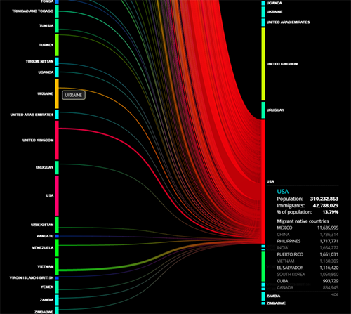
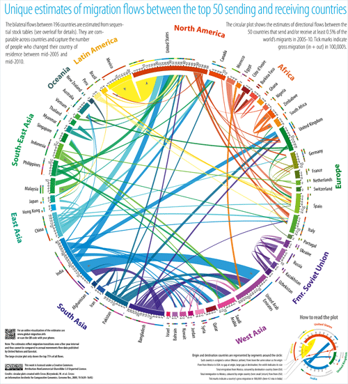
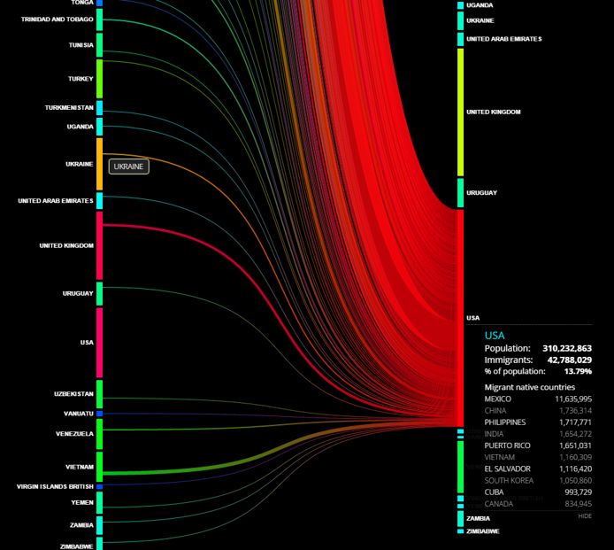
Carl Zapponi
Carlo Zapponi produced an interactive Sankey diagram to show migration flows across the world. He wrangled the data by applying weights based on bilateral migrant stocks (from population census of individual countries) to the UN Population Division’s estimates of total migrant stocks. Clicking on a country on the left side of the chart calls up a table describing the current population of that country, the emigrants from that country, and the migrant destinations. It also highlights the flows from the origin country to the migrant destination in proportionally sized lines. Similarly, clicking on a country on the right side of the chart will show immigrants, their native country in tabular and flow forms.
He produced this chart using an HTML5 toolkit for the creation of flow charts called datamovin.


(Source) (Enlarge)
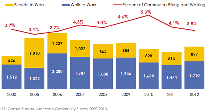
Mesa County, Colorado, 2014
Mesa County created this combination chart including stacked bar charts and a line chart to show trends in bicycling and walking, both in total terms (stacked bar charts showing the numbers of biking and walking commuters) and in relative terms (percent of all commuters who bike and walk to work). Showing these two perspectives on the same data together in one combination chart highlights that in 2010, pedestrian and bicycle commuting peaked as a percent of total commuting while it had a relatively low overall number of biking and walking commuters.
This chart was produced using Microsoft Excel and Microsoft PowerPoint.

(Source) (Enlarge)
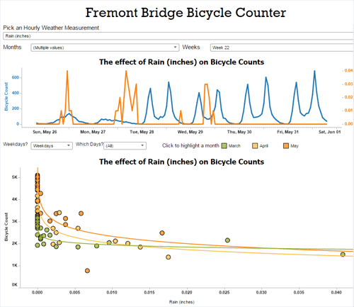
Seattle Department of Transportation, 2016
The City of Seattle, Washington created this dashboard using interactive charts to show hourly bicycle counts on the Fremont Bridge. The bar charts on the left show the annual average bicycle counts and the monthly totals. Using the same color scheme as the bar charts, the line chart in the top right shows the peak travel day of the month, for each day of the week and each month. The line chart in the bottom right shows bicycle counts over time on those peak days. Combining these into one interactive dashboard allows users to view high level information at a glance and to dive deep to answer specific questions.
The dashboard was created using Tableau.

(Source) (Enlarge)
Ta Virot Chiraphadhanakul, 2015
Virot Chiraphadhanakul developed an interactive combination chart using a sunburst chart, network diagram, and heat map to depict commuting patterns from a selected Hubway station to more than 8,000 MBTA bus/rail stops in the Boston area. He wrangled data from Hubway’s origin-destination pairs, the MBTA’s GTFS feed, and used network optimization techniques to find the shortest path among nodes. Each slice of the sunburst represents an access/transfer stop; the area of each slice represents the number of destinations that can be reached by that stop; and the color of the slice represents the travel time to the from the origin using the MBTA. He used a network diagram to show the paths from origin to all potential destinations. He used a compact space to show a great deal of dimensions and package a lot of information into a relatively small space.
The author did not submit the tools that he used to make this visualization but it clearly used advanced data visualization libraries.