
You should be understood in 5 seconds or less. Convey only essential information and keep text to a minimum.
Make key points visual anchors. Create emphasis and use easy-to-read fonts.
Stick with your fonts and colors.

Use fonts that make sense for your task.
Prefer serif fonts in print materials and sans serif in online materials.
Use right-sized text: 20-32pt for headings and 14-16pt for body.
Make web copy “responsive” to the size of the user’s screen.
Serif fonts are generally preferred for print materials: they slow the eye down as it processes the curves and embellishments of the letters.
Sans serif fonts are generally preferred for digital material: they are easiest to read on a screen as the eye registers bold, block letters.
When choosing a font, be sure to consider how many numbers and special characters you will use in your visualization to ensure the selected font includes these types of extras.
Capitalization: A mixture of upper and lower case letters is easier to read quickly and accurately.
Size: When your font is too small, it is difficult to read. When your font is too large, it limits the number of words you can fit in the same amount of space. According to BootstrapBay, 38 pixels is the average headline size, but 20-to-32-point fonts are most frequent for headlines for web typography. For web body copy, size 14-to-16-point fonts are most common.
Responsiveness: When producing web copy, consider that people access it from many screen types. A font appears differently on a smartphone screen compared with a tablet, which is different from your laptop, or your desktop.
When it comes to color, you may have heard all the terms but not understood exactly what they mean. A quick refresher on the vocab from Color Wheel Artist.
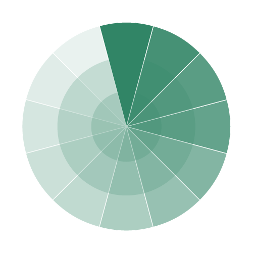
When creating visualizations, you need to determine a color palette that can be used consistently throughout the design. The palette can be monochromatic (using only one color), black and white, full color, or neutral.
Google has created a helpful online video demonstrating that within the selected primary palette alone, there are various options for regard tints and shades of the hue.
Your “scheme” defines how you use tints, shades, and tones of your color palette. For some good ones, try myPANTONE™
Your scheme should: Create contrast by using black-on-white, white-on-black, or contrasting colors and be accessible to colorblind or color-challenged readers – avoid a red-yellow-green scale!

All your visualizations intended for a Federal audience must comply with Section 508 standards. To familiarize yourself with these standards, use these resources available online:
Provide a text equivalent for every non-text element (e.g., via “alt”, “longdesc”, or element content).
Synchronize equivalent alternatives for any multimedia presentation.
Design webpages so all information conveyed in color also is available without color, as in context or markup.
Organize all documents to be readable without associated style sheets.
Provide redundant links for each active region of a server-side image map.
Provide client-side image maps rather than server-side image maps, except where regions cannot be defined with an available geometric shape.
Identify both row and column headers in data tables.
Use markup to associate data cells and header cells for data tables that have two or more logical levels of row or column headers.
Title frames with text that facilitates frame identification and navigation
In the instance that compliance cannot be accomplished in another way, provide a text-only page, with equivalent information/functionality, to ensure your website complies with stated requirements. Update the text-only page each time the primary page changes.
For pages using scripting languages to display content or create interface elements, identify all information provided by the script with functional text that assistive technology can read.
When a webpage requires an applet, plug-in or other application to interpret page content, include a link to a plug-in or applet that complies with §1194.21 (a) through (l).
Create electronic forms completed online to allow people using assistive technology to access the information, field elements, and functionality required for completion and submission of the form, including all directions and cues.
Provide a method to allow users to skip repetitive navigation links
Figure captions must contain the type of graphic in the caption title
Equations and formulas must be presented in JPEG format (not as text or in a text box).
Alt text should be clean and no more than 75 words – don’t reference color, don’t include special characters, and spell out acronyms
Image weights are less than 30 K (when possible without making illegible)
Image widths are less than 420 pixels (when possible without making illegible)
Save all files as fig[section#][figure# in section] (i.e. “fig41.jpg”), using all lowercase letters
File names should never exceed 20 characters or contain dashes, special characters, or spaces (only underscores)